This article will explore how data visualization enhances the effectiveness of healthcare organizations. It provides examples of how healthcare visualization is applied in the medical field and highlights various prominent tools currently accessible.
Contemporary healthcare data visualization tools transform intricate data into user-friendly visuals, making it understandable for various stakeholders such as physicians, patients, and government officials.
By 2025, the healthcare analytics tools market is projected to reach around $41 billion.
Key Trends in the Healthcare Analytics Market
Health Record Digitalization: The COVID-19 pandemic reminds us of the importance of digitizing health records and enhancing interoperability in the medical field. Many healthcare organizations are actively working on EMR/EHR interoperability to address this need. Digitalizing health records will empower analytics systems to collect richer data for more accurate diagnoses.
Telemetry: Patients utilize web-based and mobile remote monitoring apps for self-assessments, gathering many IoMT data to aid clinical decision-making. The telemetry sector within healthcare is projected to reach a value exceeding $27 billion by 2025.
Telemedicine: This technology enables doctors to assess patients in their homes or remotely monitor individuals with chronic conditions. It helps identify anomalies, respond to initial symptoms, and deliver proactive treatment. This serves as a valuable stream of real-time statistical data for healthcare analytics.
AI/ML Solutions: AI and machine learning have found extensive usage in healthcare, spanning activities such as drug research, sample analysis, and robot-assisted surgery. The value of AI and ML in the healthcare sector is consistently expanding and is projected to exceed $33 billion by 2025. Through AI-driven healthcare analytics, medical professionals can make well-informed decisions by leveraging diverse available data.
IoMT Technology: This rapidly expanding trend encompasses numerous innovations and is closely linked with telemedicine and telemetry. The Internet of Medical Things involves the utilization of diverse wearable sensors, ranging from basic skin temperature measurements to monitoring glucose levels in diabetes patients or heart rhythms. It plays a crucial role in supplying the necessary data for healthcare analytics.
While these are the primary trends, there are numerous others to consider. Given the dynamic nature of the healthcare analytics software market, staying updated can be challenging. Therefore, engaging a team with profound industry knowledge is advisable when developing a healthcare analytics system.
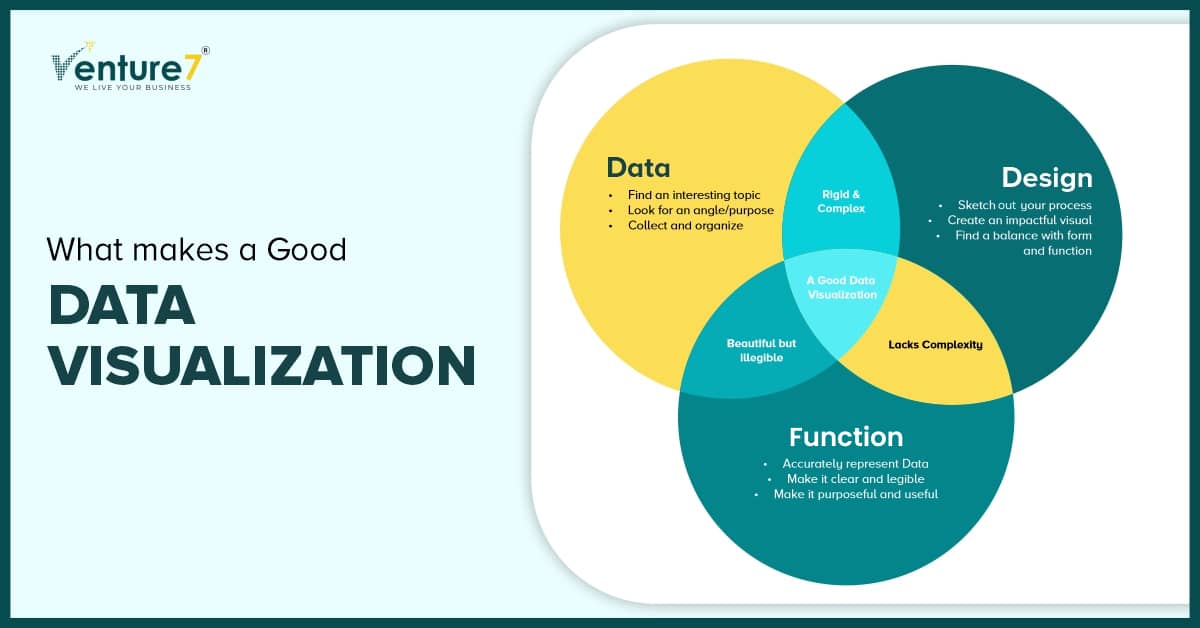
What makes a good data visualization in healthcare?
Why are some visualizations easy to understand while others are like puzzles? Some visualizations must be relearned each time, while others need only one look. Two factors contribute to novelty and cognitive incongruence. Novelty involves new types of visualizations to learn. Cognitive incongruence involves confusing visuals even with familiarity.
So what makes a good data visualization? It is explained in the below image.
Which are the main kinds of visuals employed in the healthcare sector?
Interactive Dashboards: Deliver up-to-the-minute insights and adaptable perspectives on vital healthcare metrics. This empowers experts to track patient demographics, disease prevalence, and treatment results. Such dashboards promote data exploration and well-informed choices, thereby enhancing care provision.
Interactive Apps, Sites, and Widgets: Engaging tools like applications, websites, and widgets involve patients by presenting individualized health details, including vital signs and medication timetables. With features like real-time monitoring, progress tracking, and educational materials, individuals are empowered to manage their well-being actively.
Infographics and Motion Graphics: Infographics streamline intricate medical ideas using visuals, icons, and charts. Motion graphics heighten engagement by incorporating animation and narration, making them especially potent for health education drives and public awareness efforts.
Geospatial Visualizations: Reveal geographical differences in health results and resource distribution. By layering demographic information and disease occurrence onto maps, these visualizations guide policymakers in pinpointing interventions to enhance overall population health.
Time-series Visualizations: Monitor shifts in health data across time, analyzing patterns and projecting resource requirements. These visualizations are applied to oversee disease outbreaks, evaluate treatment efficacy, and comprehend the lasting effects of public health measures.
Difficulties healthcare organizations encounter when attempting to visualize data:
- Unifying diverse data sources is a significant hurdle.
- Disparate datasets from various sources complicate comprehensive visualization.
- Siloed data assets hinder collaboration and accessibility.
- Limited access to visualization systems limits project generation and collaboration.
- Education and training gaps for data experts affect effective visualization.
- Design principles like color theory impact creating efficient visualizations.
To address these issues, healthcare organizations must invest in comprehensive data solutions, promote collaboration among different departments, and prioritize training programs highlighting healthcare data visualization’s importance.
Introducing Data Visualization Software in Healthcare:
- Appoint a skilled specialist to research and compare available software packages for healthcare data visualization.
- Determine if existing solutions can fulfill your specific company requirements.
- Decide on integrating a graphical module into the current EHR or EMR system with visualization and analytical features.
- Evaluate the need for customized software, outlining desired features and budget.
- Employ a team of experienced developers specialized in healthcare data visualization.
- Explore various collaboration models and software development companies.
- Keep software development outsourcing as an option for project management, engineering, and quality assurance.
- Maintain consistent communication between the development team and stakeholders.
- Conduct thorough testing, validation, and training during the implementation process.
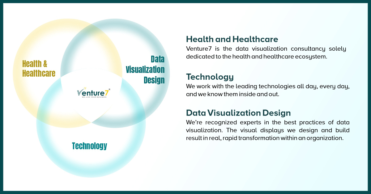
Visualize your Healthcare Data with Venture7
Healthcare data visualization constitutes a vital phase in data analysis. It accelerates comprehension and fosters deeper insights, leading to better decisions and swift responses as required. The significance of data visualization in healthcare cannot be overstated. Its application spans from refining care delivery and coordination to educating patients and enhancing overall performance.
If you seek comprehensive visualization software tailored to your specifications, collaborating with a dependable health tech company like Venture7 can give you a head start.
Specializing in healthcare software development, Venture7 can aid in crafting a data visualization solution or seamlessly integrating a pre-existing one into your system.
We maintain HIPAA and GDPR compliance, and our expertise empowers us to construct a healthcare software product that aligns with your organization’s needs.


